











A clean, intuitive interface doesn’t just look elegant—it helps people navigate effortlessly, complete tasks faster, and enjoy a more satisfying digital experience.
True simplicity isn’t about removing features. It’s about removing unnecessary complexity.
“Simplicity is the ultimate sophistication.”
— Leonardo da Vinci
Less Clutter, More Clarity
Modern interfaces should guide users toward what matters most. By reducing visual noise and prioritizing essential content, designers make it easier for people to focus on their goals instead of figuring out how the interface works.
Clear typography, generous whitespace, and thoughtful layouts create an experience that feels calm, organized, and easy to navigate.


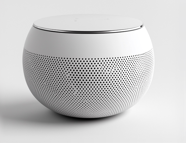

Every Element Should Have a Purpose
Great interface design is intentional. Every button, icon, animation, and section should contribute to the user’s journey.
When unnecessary elements are removed, the remaining components become more meaningful. Users spend less time searching for information and more time accomplishing what they came to do.
Simplicity is not the absence of functionality—it’s the presence of clarity.
Better Experiences Through Consistency
Simple interfaces become even more powerful when paired with consistency. Reusable components, predictable navigation, and familiar interaction patterns help users build confidence as they move through a product.
Instead of learning something new on every screen, users can rely on established patterns that feel natural and intuitive.
This consistency reduces cognitive effort and creates a smoother overall experience.
“Perfection is achieved, not when there is nothing more to add, but when there is nothing left to take away.”
— Antoine de Saint-Exupéry
Simplicity Improves Performance
Minimal interfaces often perform better because they focus on efficiency. Cleaner layouts, optimized assets, and streamlined interactions contribute to faster loading times and smoother performance across all devices.
A fast, responsive experience not only improves usability but also builds trust and increases user satisfaction.
Designing for Everyone
Simple design is also more accessible. Clear navigation, readable typography, logical layouts, and sufficient contrast make digital products easier to use for people with different abilities, devices, and levels of technical experience.
When an interface is easy to understand, it becomes more inclusive for everyone.
Final Thoughts
The power of simplicity lies in its ability to make technology feel effortless. Rather than impressing users with complexity, great interface design quietly supports them, helping them achieve their goals without distraction.
By focusing on clarity, consistency, and purposeful design, businesses can create digital experiences that are not only beautiful but also intuitive, accessible, and built to stand the test of time.